10,000 search results
(0.026 seconds)
- BALL - Unknown license

- cheek2cheek (black!) - Unknown license

- Galla - Unknown license

- JazzText - Unknown license

- HipnOtik - Unknown license

- Showtime - Unknown license

- Seaquest - Unknown license

- cheek2cheek (faded!) - Unknown license

- ginger2 - Unknown license

- Sad Films - Unknown license

- Phino Tight - Unknown license

- Square Unique - Unknown license

- Soopafresh - Unknown license

- Cauldron - Unknown license

- Sham - Unknown license

- Eclipse - Unknown license

- Dwarves - Unknown license

- Castro - Unknown license

- Frequency Mod - Unknown license

- WWFancyHats - Unknown license

- StageDive - Unknown license

- Linotype MhaiThaipe by Linotype,
$29.99Linotype Mhai Thaipe is part of the Take Type Library, chosen from the entries of the Linotype-sponsored International Digital Type Design Contests of 1994 and 1997. The work of German designer Markus Remscheid, the name is not hard to recognize as an English-Asian play on my type and describes its general character. The small circles which ornament the alphabet and the unusual flowing forms which look like a mixture of Arabic and Sanskrit combine to give the typeface an ornamental, exotic look. Linotype Mhai Thaipe is best used for headlines with point sizes of 12 or larger. - Linotype Rowena by Linotype,
$29.99Linotype Rowena is part of the Take Type Library, selected from the contestants of Linotype’s International Digital Type Design Contests of 1994 and 1997. This text font was designed by the Latvian artist Gustavs A. Grinbergs and is available in six weights, from light to black. The font has a light stroke contrast and its basic forms are the circle, rectangle and triangle, making it a constructed face. The impression of the font on the reader is elegant and cool, very like poster fonts of the 1930s. Linotype Rowena is suitable for headlines and shorter texts with point sizes 12 and larger. - Linotype Brewery by Linotype,
$29.99Linotype Brewery is part of the Take Type Library, chosen from the contestants in the International Digital Type Design Contests of 1994 and 1997. This text font is available in six weights from light to black and was designed by Gustav A. Grinberg. An outstanding characteristic of the font is its light stroke contrast and its constructed forms. Its tiny, triangular serifs first become noticeable in very large typesizes, much like the Dutch fonts of the 17th century, Copperplate, for example. Linotype Brewery is cool and elegant and well-suited to middle-length texts and headlines. - Gobbler by Chank,
$49.00Gobble gobble gobble! The Gobbler font was drawn with a leaky pen on a napkin at the Modern Cafe in Northeast Minneapolis while the designer, Mister Chank Diesel, was waiting for some pot roast. “Apple cobbler drippings on the napkin add more character to the strokes of each letter,” says Chank. This font was originally named Modern Napkin, a free font released in 1997. Chank completed the character set, fixed some curves, and cleaned up some of the apple cobbler to make a more elegant font in 1999. Gobbler works great for either text or display purposes. - Linotype Zensur by Linotype,
$29.99Linotype Zensur is part of the Take Type Library, chosen from the entries of the Linotype-sponsored International Digital Type Design Contests of 1994 and 1997. This fun font was created by French designer Gérarld Alexandre and contains one weight. The characters look as though parts of each of them were censored or removed, leaving just enough left over to know what was meant. The basic forms of this font are sans serif and the rounded corners give it an almost soft character. Linotype Zensur is a distinctive typeface which is especially good for headlines in larger point sizes. - Linotype Renee Display by Linotype,
$29.00Linotype Renee is part of the Take Type Library, selected from contestants of Linotype’s International Digital Type Design Contests of 1994 and 1997. It was a prize-winning entry of American designer Renee Ramsey-Passmore. The letters of this font are strictly constructed with a grid, which is still visible in the weight Types + Lines. The figures are designed with only the basic forms of circle, rectangle and triangle, giving the font an individual and technical feel. Some letters are only recognizable in the context of a word, making Linotype Renee exclusively for short headlines in large point sizes. - NoweAteny by Linotype,
$29.99Linotype Nowe Ateny is part of the Take Type Library, which features the winners of Linotype’s International Digital Type Design Contest from 1994 to 1997. Designed by Dariusz Nowak-Nova, Nowe Ateny is a frantic handwriting font whose capital letters include technical-looking grid lines and end points. These seem to anchor the letters without reducing their volatility. The font consciously lacks elements which increase legibility, sacrificing them for the sake of more design oriented ideals. Nowe Ateny is thus good for headlines in larger point sizes, especially when the look of the text is as important as its content. - Linotype Vision by Linotype,
$29.99Linotype Vision is part of the Take Type Library, chosen from the entries of the Linotype-sponsored International Digital Type Design Contests of 1994 and 1997. Created by German designer Dan-André Neimeyer, the font contains five weights. The characters look as though they are constructed of fragments fitted only loosely together. Just enough of each character is put onto paper so that the eye of the reader can complete the conventional form. Based loosely on sans serif forms, the font has a futuristic, mathematical feel. Linotype Vision is exclusively for headlines in point sizes of 18 and larger. - Linotype Sjablony by Linotype,
$29.99Linotype Sjablony is part of the Take Type Library, chosen from the entries of the Linotype-sponsored International Digital Type Design Contests of 1994 and 1997. Designed by Dutch artist Mark van Wageningen, the typeface with its interrupted strokes has the characteristics of the stencils seen on crates and barrels. The difference lies in the raw contours of this font, which make the characters look as though they were slowly eroded away by water and wind. Linotype Sjablony is composed exclusively of heavy capital letters and is particular suitable for initials and headlines with point sizes of 18 and larger. - Linotype Laika by Linotype,
$29.99Linotype Laika is part of the Take Type Library, chosen from the entries of the Linotype-sponsored International Digital Type Design Contests of 1994 and 1997. This fun font was created by Dutch designer Mark van Wageningen, who based its forms on those of a sans serif font but gave them wavy, irregular contours. They look almost as though they lie just under the surface of a pool and the movement of the water gives them their undulating appearance. The dynamic Linotype Laika is especially good for headlines in larger point sizes or shorter texts in point sizes of 14 or larger. - Linotype Irish Text by Linotype,
$29.99Linotype Irish Text is part of the Take Type Library, chosen from the contestants of Linotype’s International Digital Type Design Contests of 1994 and 1997. German artist Torsten Weisheit designed this font based on Irish scripts of the 5th century. Characteristic of this style is the mixture of upper case letters in the mostly lower case alphabet and vice versa. The letters look as though written with a broad tipped pen and have triangular serifs, displaying a decorative tendency akin to that of Irish calligraphy. Linotype Irish Text is intended exclusivley for headlines in large point sizes. - Rubber Stamp by ITC,
$39.00Created in 1983 by British artist Alan Birch, this dramatic design conveys all the immediacy, impact, and effect of a stencil or rubber-stamp on paper. With a corroded, rough-around-the-edges feeling, Rubber Stamp gives an impression similar to the old, beat-up looking typewriter fonts that were popular among designers during the 1990s. Rubber Stamp is an all caps font, and is primarily suited for many headline and display applications that use larger point sizes. Try out Rubber Stamp in magazines, newsletters, and any other work that would be enhanced by a stencil, branding, or rubber stamp effect. - Merlin by Linotype,
$29.00Linotype Merlin is part of the Take Type Library, which features the winners of Linotype’s International Digital Type Design Contest from 1994 to 1997. This font was designed by Anne Boskamp and its alphabet consists exclusively of capital letters. At the same time aggressive and sensitive, Merlin looks as though it were scratched onto paper with a pen tip saturated with ink. Like characters from another time, the letters fall into place and make an impression which is both vulnerable and strong, lively and reserved. Merlin’s historical roots lie in the archaic pictograms in the caves of Stone Age civilizations. - Linotype Russisch Brot by Linotype,
$29.00Linotype Russisch Brot is part of the Take Type Library, chosen from the entries of the Linotype-sponsored International Digital Type Design Contests of 1994 and 1997. The inspiration of German designer Markus Remscheid is not hard to see for those who are familiar with the chocolate cookies in the form of letters which are called Russisches Brot. The font is available in six weights. The basic weight is perfectly legible and is good for both headlines and shorter texts and from there the weights become more and more nibbled away, leaving the basic form of the characters and a few crumbs. - Linotype Sketch by Linotype,
$29.99 Linotype Sketch is part of the Take Type Library, chosen from the contestants of Linotype’s International Digital Type Design Contests of 1994 and 1997. German designer Dieter Kurz gave his display font a calligraphic character. The forms lean slightly to the right and have a spontaneous and individual look. This light, cheerful font also displays a harmony among the forms and gives text a personal touch. Linotype Sketch combines well with modern text fonts which have the same narrow proportions. This font is well-suited for headlines and short and middle length texts with point size 12 or larger.
 - Linotype Not Painted by Linotype,
$29.99Linotype Not Painted is part of the Take Type Library, chosen from the contestants of Linotype’s International Digital Type Design Contests of 1994 and 1997. This fun font from German designer Robert Bucan grabs attention immediately. The forms are made up of multiple layers. The upper case’ alphabet forms, numerals and punctuation are two different styles of the same character, one over the other, and the lower case’ letters are composed of the lower case and upper case of the same letter superimposed. Linotype Not Painted is particularly good as a headline font in larger point sizes. - Mochary by Mans Greback,
$59.00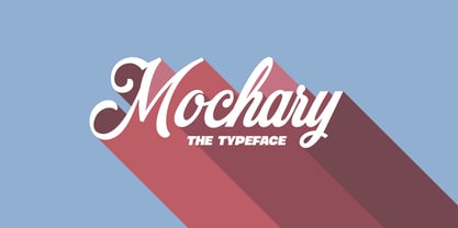 A beautiful and high-quality script font with contextual and stylistic alternates and ligatures.
 - Stay Bright by Ivan Rosenberg,
$12.00 Stay Bright is a modern font duo consisting of a signature style script and elegant serif font. Both fonts includes multilingual support for Western and Central Europe. Is ideal for weddings invitations, baby showers, blog website, instagram, branding, invitations, business cards, and many more. This font also include complete set of alternates and stylistic ends for lowercase characters. Stay Bright Script : It contains one set of opentype stylistic lowercase alternates and one set of opentype stylistic ends. Script version contains 55 LIGATURES. Stay Bright Font Duo contains following characters: AÁĂÂÄÀĀĄÅÃÆBCĆČÇDÐĎĐEÉĚÊËĖÈĒĘFGĢHIÍÎÏÌĪĮJKĶLĹĽĻŁMNŃŇŅŊÑOÓÔÖÒŐŌØÕŒPÞ QRŔŘŖSŚŠŞTŦŤŢUÚÛÜÙŰŪŲŮVWẂŴẄẀXYÝŶŸỲZŹŽŻ aáăâäàāąåãæbcćčçdðďđeéěêëėèēęfgģhiíîïìīįjkķlĺľļłmnńňņŋñoóôöòőōøõœpþqrŕřŗsśšş ßtŧťţuúûüùűūųůvwẃŵẅẁxyýŷÿỳzźžż
 - Asly Brush by Artisan Studio,
$12.00 Asly Brush is the font style handmade dancing and then live trace to have Grungy brush and unique forms of calligraphy, the writing style is very natural. The Features of this fonts is: Standart ligatures Stylistic Alternates Stylistic sets PUA Unicode (Private Use Areas) Can be used for various purposes.such as headings, logos, wedding invitation, t-shirt, letterhead, signage, labels, news, posters, badges etc. To enable the OpenType Stylistic alternates, you need a program that supports OpenType features such as Adobe Illustrator CS, Adobe Indesign & CorelDraw X6-X7


